
Dec 29, 2025
Real-Time Schema Visualization: Why ChartDB Eliminates Manual Syncing
Real-Time Schema Visualization: Why ChartDB Eliminates Manual Syncing
Real-Time Schema Visualization: Why ChartDB Eliminates Manual Syncing
Stop chasing outdated database diagrams. Learn why manual schema syncing breaks teams, and how ChartDB keeps schema visualization up to date with fast, repeatable refresh.
Stop chasing outdated database diagrams. Learn why manual schema syncing breaks teams, and how ChartDB keeps schema visualization up to date with fast, repeatable refresh.
Stop chasing outdated database diagrams. Learn why manual schema syncing breaks teams, and how ChartDB keeps schema visualization up to date with fast, repeatable refresh.

Jonathan Fishner
7 minutes read
Introduction
You know that moment when someone says, “Can you share the ERD?” and you confidently paste the link… then immediately remember you haven’t updated it since the last migration.
So you open the diagram tool, start hunting for the new table, realize three columns got renamed, and fifteen minutes later you are still dragging boxes around like it’s 2009.
If you are an engineer, data architect, or product team that relies on accurate schema diagrams, you’ve probably lived this story. And it’s annoying because it always happens at the worst time. During an incident. During onboarding. During a review.
I’m Jonathan, co-founder of ChartDB. We built ChartDB to make database schemas easy to visualize, understand, and share, without turning “keeping the diagram updated” into a weekly chore.
In this post, I’ll walk through why manual syncing breaks down in real teams, and how ChartDB keeps schema visualization in sync with the source of truth in a way that feels effortless.
The Problem With Manual Syncing
Schemas change constantly
Even if your team has “a stable schema,” it still changes. New features add tables. Hotfixes add columns. Someone adds an index and forgets to tell anyone. And if you work with microservices or multiple databases, the churn multiplies.
The diagram cannot be a one-time deliverable. If it isn’t refreshed regularly, it becomes a historical artifact.
Manual updates eat time and focus
The hidden cost is not just time. It’s context switching. You were in the middle of debugging a query or reviewing a PR, and suddenly you are doing diagram maintenance.
It feels small at the moment, but it piles up. The result is predictable: people stop updating diagrams.
Outdated diagrams lead to bad decisions
A stale diagram is worse than no diagram.
If a relationship is missing, you may design a feature with the wrong assumptions. If a column got renamed, someone might ship a query that breaks. If a table got split, your analytics pipeline might keep writing to the old shape.
A diagram is supposed to reduce risk. An outdated diagram quietly increases it.
Collaboration becomes messy
Manual syncing creates a weird social problem: nobody is sure who owns the diagram.
One person updates it, another person exports a PNG, a third person pastes that PNG into Confluence, and now you have three versions that disagree. Add a remote team and you get a fourth version in a Slack thread.
Human error is inevitable
Even a careful person misses things.
A new junction table gets added and nobody connects it. A relationship exists in code but not in the diagram. A table gets deleted but still sits there, haunting the schema like a ghost.
Manual diagramming is basically asking humans to be perfect librarians. We are not.
This becomes a workflow bottleneck
When the diagram is out of date, every discussion slows down.
Architecture reviews become debates. Onboarding becomes verbal explanations. Incident response becomes guesswork. The tool meant to speed you up becomes another thing you have to maintain.
Bonus pain: diagrams drift from the real system
This is the quiet killer.
The database is the source of truth, but the diagram becomes a separate “document” that requires active upkeep. Over time, the diagram stops reflecting reality, and teams lose trust in it.
Once trust is gone, diagrams stop being used, and the whole thing becomes wasted effort.
How ChartDB Keeps Schemas in Sync Automatically
Here is the basic idea behind ChartDB: your schema visualization should be derived from the schema itself, not manually redrawn.
If you can pull the schema reliably, you can refresh the diagram reliably. That is how you eliminate the “sync tax.”
Below is a step-by-step flow you can follow. Treat it like a mini tutorial.
Step 1: Start with a schema import that matches your workflow
Most teams do one of these:
Import from SQL or DDL when you already have migration files
Import from a database connection when you want the schema directly from the source
Either way, you are not drawing boxes. You are generating the diagram from the schema.
Step 2: Generate the initial ERD automatically
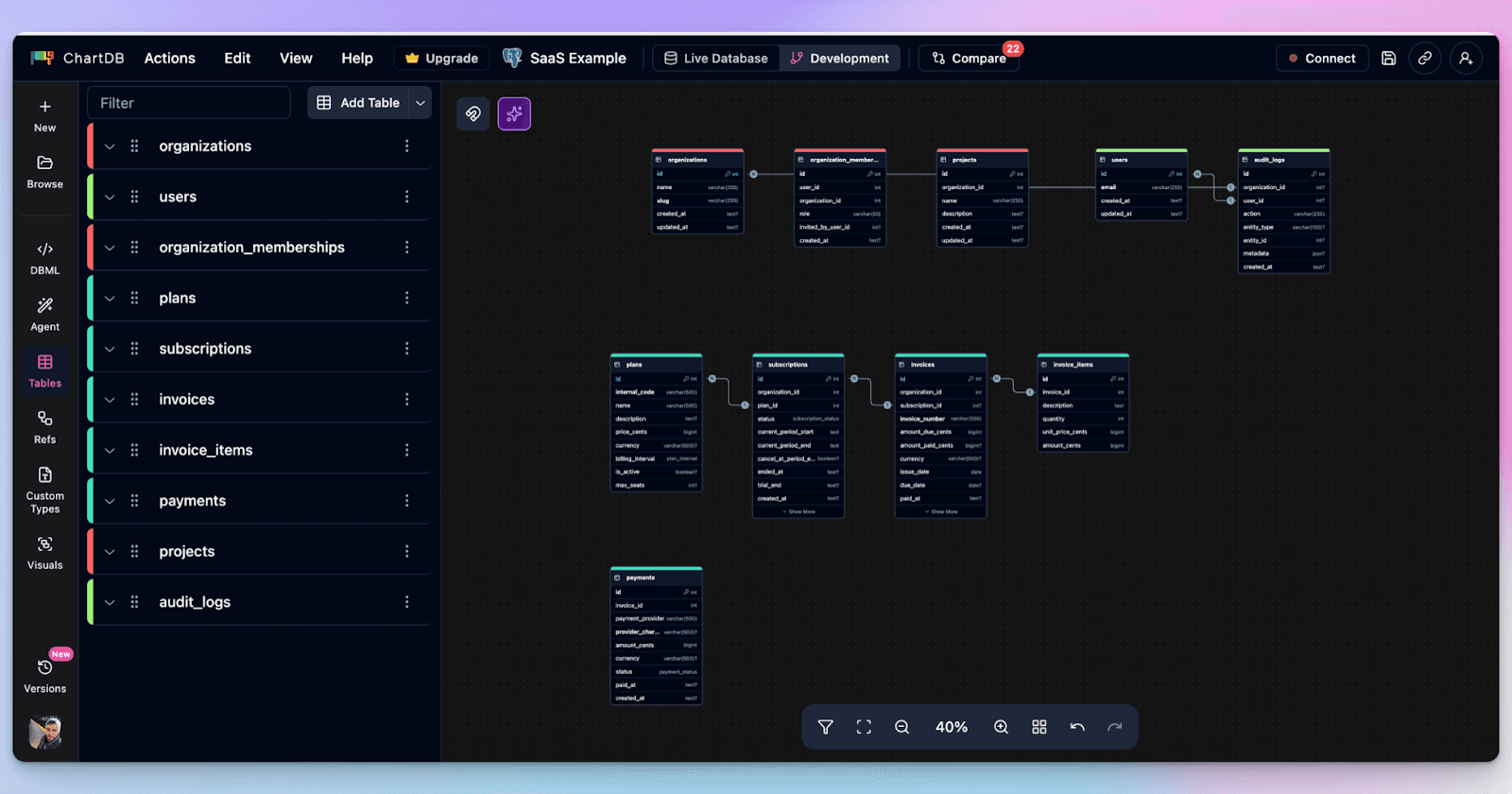
Once you import, ChartDB builds the diagram: tables, columns, and relationships.
This is the part that usually takes forever in manual tools. In ChartDB, it is the starting point.
Step 3: Organize the diagram so it stays readable
This is where teams usually give up on large schemas.
In ChartDB, you can use a couple of simple techniques that make big diagrams feel manageable:
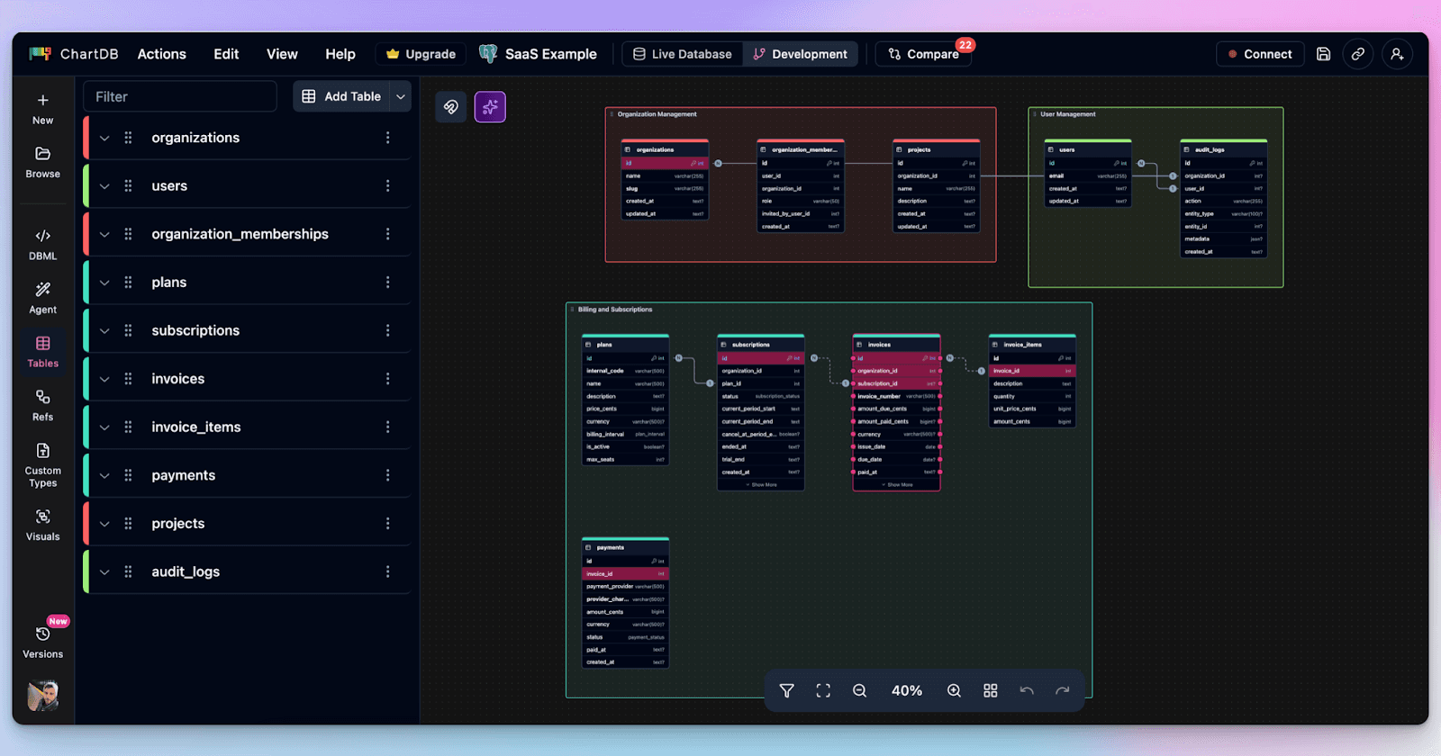
Color tables by domain so billing does not look like auth
Use Areas to group related tables into visual zones
Hide or focus on specific schemas when you do not need the entire universe
This matters for syncing because a refreshed diagram should not feel like chaos. It should feel like the same map, just updated.
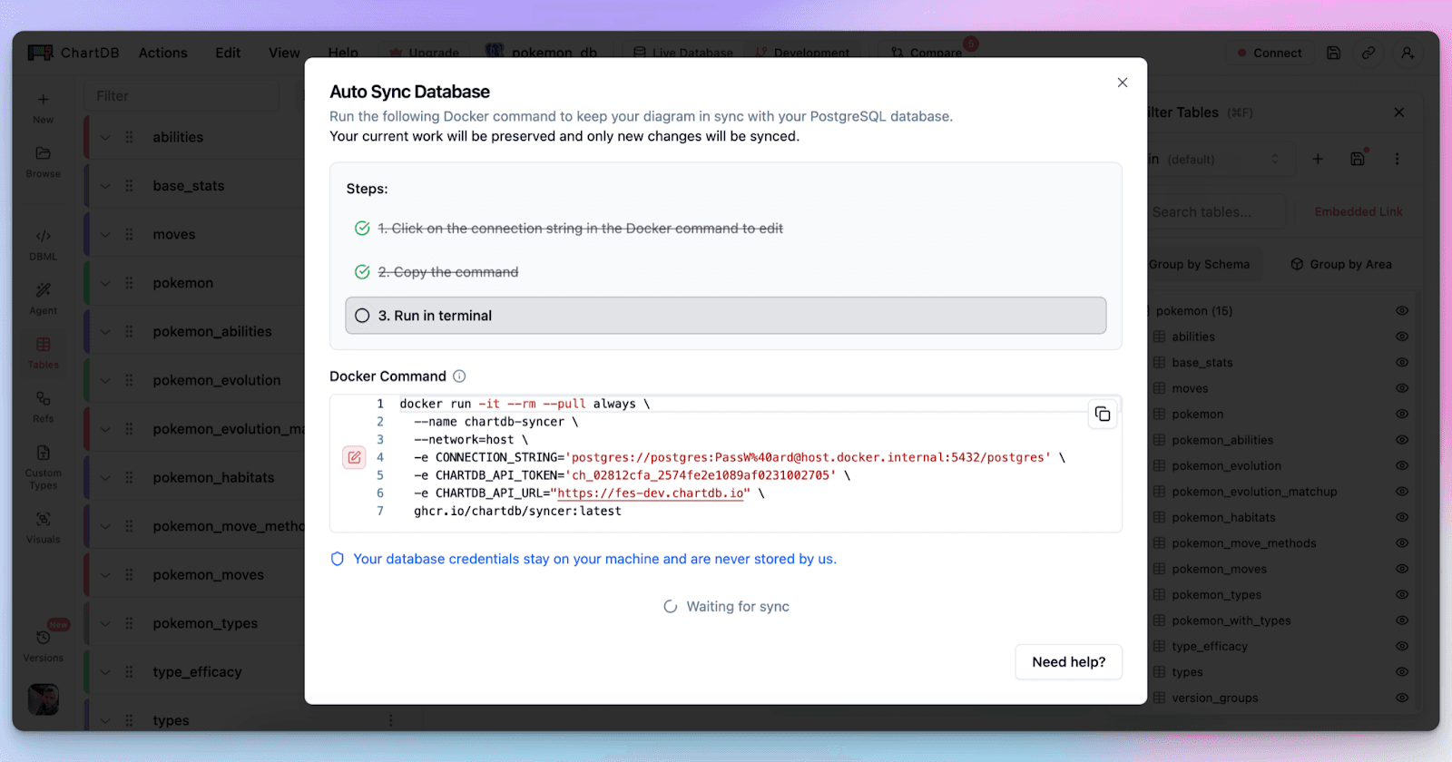
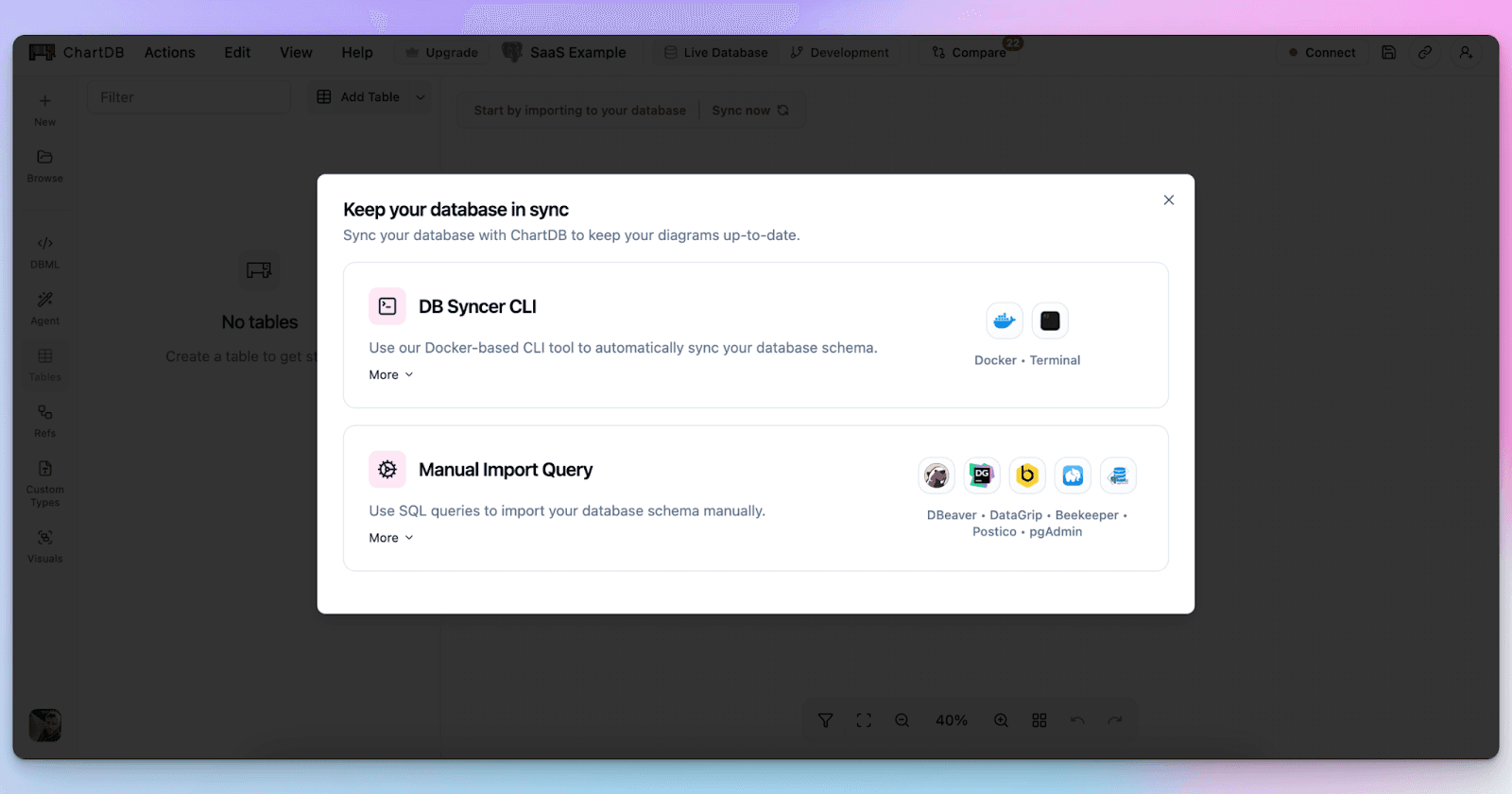
Step 4: Refresh when the schema changes
When your schema changes, you do not manually update the diagram.
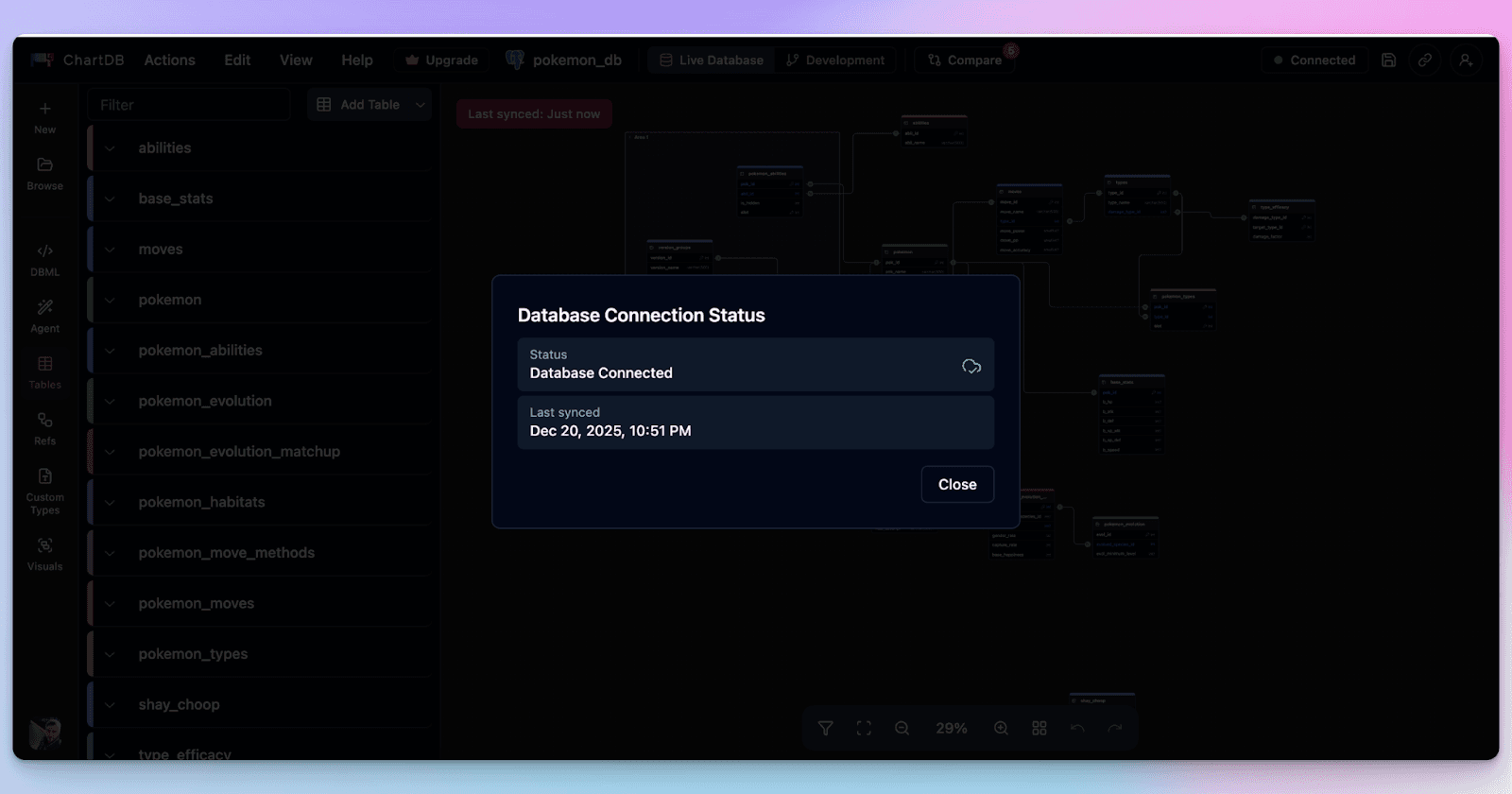
You refresh by re-importing or pulling the schema again through the same flow you used originally. This is one of the features that keeps your ERDs sync with your database. The key is that the refresh is repeatable. You are not relying on memory or manual edits.
This is the part that removes the mental overhead. You are not thinking “did I update the diagram?” You are thinking “did we ship the migration?” The diagram follows.
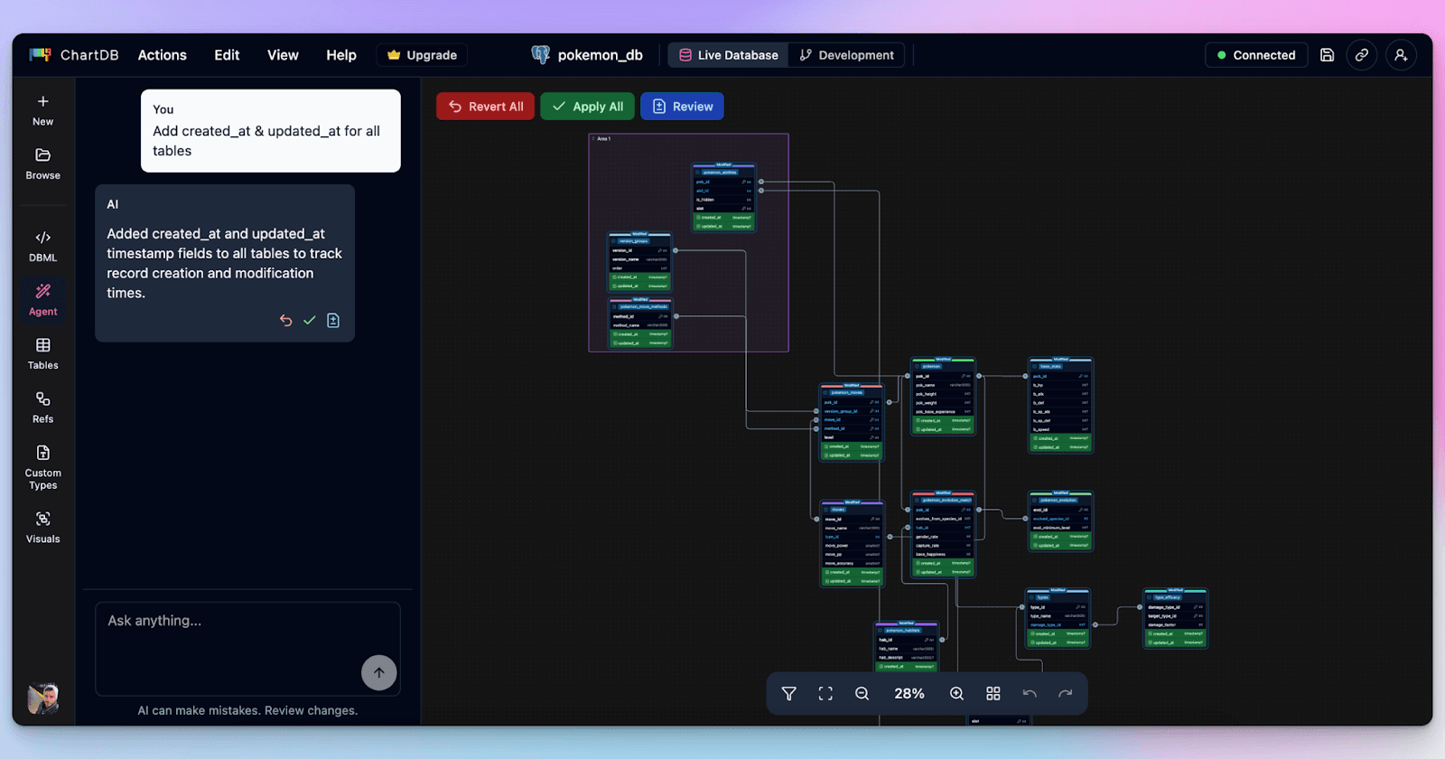
Step 5: Use AI to fix the annoying stuff faster
This is optional, but it is where a lot of teams get real value.
After a refresh, you might want to:
Add common patterns like timestamps or soft deletes across tables
Detect missing foreign keys in legacy databases
Clean up naming so the schema is consistent
Suggest indexes for obvious join paths
Doing that manually is slow. With ChartDB’s AI agent, you can handle a lot of it with simple prompts, then review the changes visually.
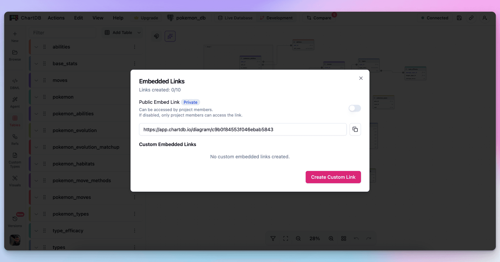
Step 6: Share one link, not seven screenshots
The last step is the one that actually changes team behavior.
If your diagram is always refreshable, it becomes safe to share. You can send a link in a PR. You can onboard someone with a single diagram. You can drop it into docs without worrying that it will be outdated next week.
That is how teams stop treating schema diagrams as fragile artifacts.
Conclusion
Manual syncing is frustrating because it’s busywork that quietly breaks trust. The schema changes, the diagram does not, and suddenly everyone is making decisions with the wrong map.
ChartDB removes that hassle by making schema visualization something you can refresh from the source of truth, quickly and consistently. Add collaboration on top, and you finally get diagrams that stay useful over time.
If you want to feel this difference on your own database, try ChartDB and run one refresh cycle. Import, visualize, change the schema, refresh. You’ll get it.
Try ChartDB for your own database and see how simple schema syncing can be.
More resources
Introduction
You know that moment when someone says, “Can you share the ERD?” and you confidently paste the link… then immediately remember you haven’t updated it since the last migration.
So you open the diagram tool, start hunting for the new table, realize three columns got renamed, and fifteen minutes later you are still dragging boxes around like it’s 2009.
If you are an engineer, data architect, or product team that relies on accurate schema diagrams, you’ve probably lived this story. And it’s annoying because it always happens at the worst time. During an incident. During onboarding. During a review.
I’m Jonathan, co-founder of ChartDB. We built ChartDB to make database schemas easy to visualize, understand, and share, without turning “keeping the diagram updated” into a weekly chore.
In this post, I’ll walk through why manual syncing breaks down in real teams, and how ChartDB keeps schema visualization in sync with the source of truth in a way that feels effortless.
The Problem With Manual Syncing
Schemas change constantly
Even if your team has “a stable schema,” it still changes. New features add tables. Hotfixes add columns. Someone adds an index and forgets to tell anyone. And if you work with microservices or multiple databases, the churn multiplies.
The diagram cannot be a one-time deliverable. If it isn’t refreshed regularly, it becomes a historical artifact.
Manual updates eat time and focus
The hidden cost is not just time. It’s context switching. You were in the middle of debugging a query or reviewing a PR, and suddenly you are doing diagram maintenance.
It feels small at the moment, but it piles up. The result is predictable: people stop updating diagrams.
Outdated diagrams lead to bad decisions
A stale diagram is worse than no diagram.
If a relationship is missing, you may design a feature with the wrong assumptions. If a column got renamed, someone might ship a query that breaks. If a table got split, your analytics pipeline might keep writing to the old shape.
A diagram is supposed to reduce risk. An outdated diagram quietly increases it.
Collaboration becomes messy
Manual syncing creates a weird social problem: nobody is sure who owns the diagram.
One person updates it, another person exports a PNG, a third person pastes that PNG into Confluence, and now you have three versions that disagree. Add a remote team and you get a fourth version in a Slack thread.
Human error is inevitable
Even a careful person misses things.
A new junction table gets added and nobody connects it. A relationship exists in code but not in the diagram. A table gets deleted but still sits there, haunting the schema like a ghost.
Manual diagramming is basically asking humans to be perfect librarians. We are not.
This becomes a workflow bottleneck
When the diagram is out of date, every discussion slows down.
Architecture reviews become debates. Onboarding becomes verbal explanations. Incident response becomes guesswork. The tool meant to speed you up becomes another thing you have to maintain.
Bonus pain: diagrams drift from the real system
This is the quiet killer.
The database is the source of truth, but the diagram becomes a separate “document” that requires active upkeep. Over time, the diagram stops reflecting reality, and teams lose trust in it.
Once trust is gone, diagrams stop being used, and the whole thing becomes wasted effort.
How ChartDB Keeps Schemas in Sync Automatically
Here is the basic idea behind ChartDB: your schema visualization should be derived from the schema itself, not manually redrawn.
If you can pull the schema reliably, you can refresh the diagram reliably. That is how you eliminate the “sync tax.”
Below is a step-by-step flow you can follow. Treat it like a mini tutorial.
Step 1: Start with a schema import that matches your workflow
Most teams do one of these:
Import from SQL or DDL when you already have migration files
Import from a database connection when you want the schema directly from the source
Either way, you are not drawing boxes. You are generating the diagram from the schema.
Step 2: Generate the initial ERD automatically
Once you import, ChartDB builds the diagram: tables, columns, and relationships.
This is the part that usually takes forever in manual tools. In ChartDB, it is the starting point.
Step 3: Organize the diagram so it stays readable
This is where teams usually give up on large schemas.
In ChartDB, you can use a couple of simple techniques that make big diagrams feel manageable:
Color tables by domain so billing does not look like auth
Use Areas to group related tables into visual zones
Hide or focus on specific schemas when you do not need the entire universe
This matters for syncing because a refreshed diagram should not feel like chaos. It should feel like the same map, just updated.
Step 4: Refresh when the schema changes
When your schema changes, you do not manually update the diagram.
You refresh by re-importing or pulling the schema again through the same flow you used originally. This is one of the features that keeps your ERDs sync with your database. The key is that the refresh is repeatable. You are not relying on memory or manual edits.
This is the part that removes the mental overhead. You are not thinking “did I update the diagram?” You are thinking “did we ship the migration?” The diagram follows.
Step 5: Use AI to fix the annoying stuff faster
This is optional, but it is where a lot of teams get real value.
After a refresh, you might want to:
Add common patterns like timestamps or soft deletes across tables
Detect missing foreign keys in legacy databases
Clean up naming so the schema is consistent
Suggest indexes for obvious join paths
Doing that manually is slow. With ChartDB’s AI agent, you can handle a lot of it with simple prompts, then review the changes visually.
Step 6: Share one link, not seven screenshots
The last step is the one that actually changes team behavior.
If your diagram is always refreshable, it becomes safe to share. You can send a link in a PR. You can onboard someone with a single diagram. You can drop it into docs without worrying that it will be outdated next week.
That is how teams stop treating schema diagrams as fragile artifacts.
Conclusion
Manual syncing is frustrating because it’s busywork that quietly breaks trust. The schema changes, the diagram does not, and suddenly everyone is making decisions with the wrong map.
ChartDB removes that hassle by making schema visualization something you can refresh from the source of truth, quickly and consistently. Add collaboration on top, and you finally get diagrams that stay useful over time.
If you want to feel this difference on your own database, try ChartDB and run one refresh cycle. Import, visualize, change the schema, refresh. You’ll get it.
Try ChartDB for your own database and see how simple schema syncing can be.
More resources

Continue Reading


© 2026 ChartDB
Product
Free Tools
© 2025 ChartDB
Product
Free Tools
© 2025 ChartDB